Stretching an image.
The Histogram
A good understanding of the histogram is the key to getting the most out of the data in the image. The histogram is a graphic display of all the information the image contains. Almost all programs which allow image stretching will have a version of it.
Pure black is to the far left, with a value of 0/0/0, and is known as the 'black point'. Pure white isto the far right, with a value of 245/245/245, and is known as the 'white point'. Anything that isn't hard to the left or right is a shade of grey.... the further to the left the darker it is, and the further to the right, the lighter. The values refer to the amount of red, green and blue, the smallest amount of which is zero, and the largest amount, 245.
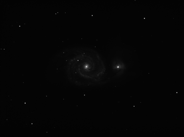
When an image has first been stacked, there will, in all likelihood be very little to see. It's likely to look something like this, an unstretched image of the Whirlpool Glaxy, M51. This view is not too different from that which you would see from a very dark site with a large telescope. Most of the image is still very faint, and only a little detail is visible. This image is the result of almost 14 hours worth of 10 and 15 minute sub exposures with a TMB 6 inch refractor.
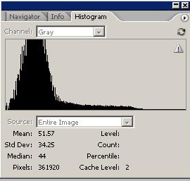
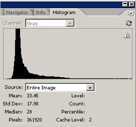
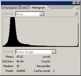
This is the histogram of the first, unstretched image......
The bulk of the information is in the black hill to the far left of the image, with a thin black line, broken from around the middle, which runs along the bottom all the way to the right. Most of the information is in the dark part of the image. The part of the histogram containing most of the information is very narrow, meaning that all of the data is compressed into a small tonal range.
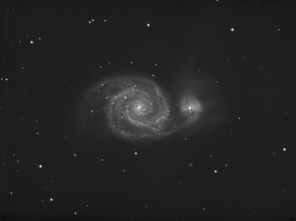
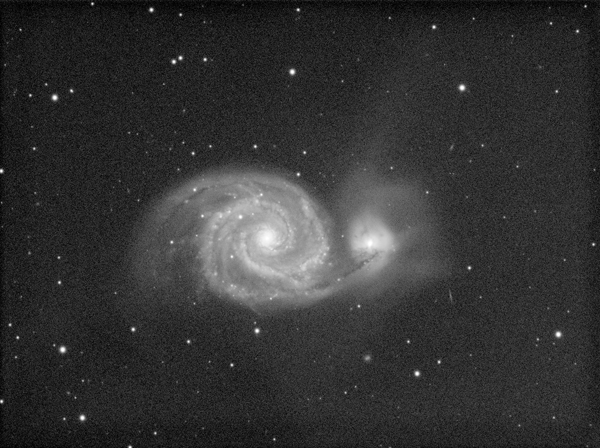
This is the same image after it has been carefully stretched, to make the darker areas brighter, while controlling the light areas so that they are not oversaturated.
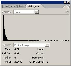
This is its histogram......
The main block of data has got a lot bigger, and now covers a much greater tonal range. It is also all further right, and there is a gap to the left where there is no dark line. This means there is no data there. The darkest parts of the image are now brighter than they were before. This is what we mean when we talk about stretching the data.
The Black Point and White point.
As was mentioned earlier, the two extreme points on the histogram are known as the black point and white point. It is possible to move these points using the 'Levels' command in Photoshop. (IMAGE/ADJUST/LEVELS).
Black Point adjustment.
Adjusting your black point using levels is one of the ways that data is optimised and stretched, and it is important to use the levels command carefully, as data can easily be lost at this stage.
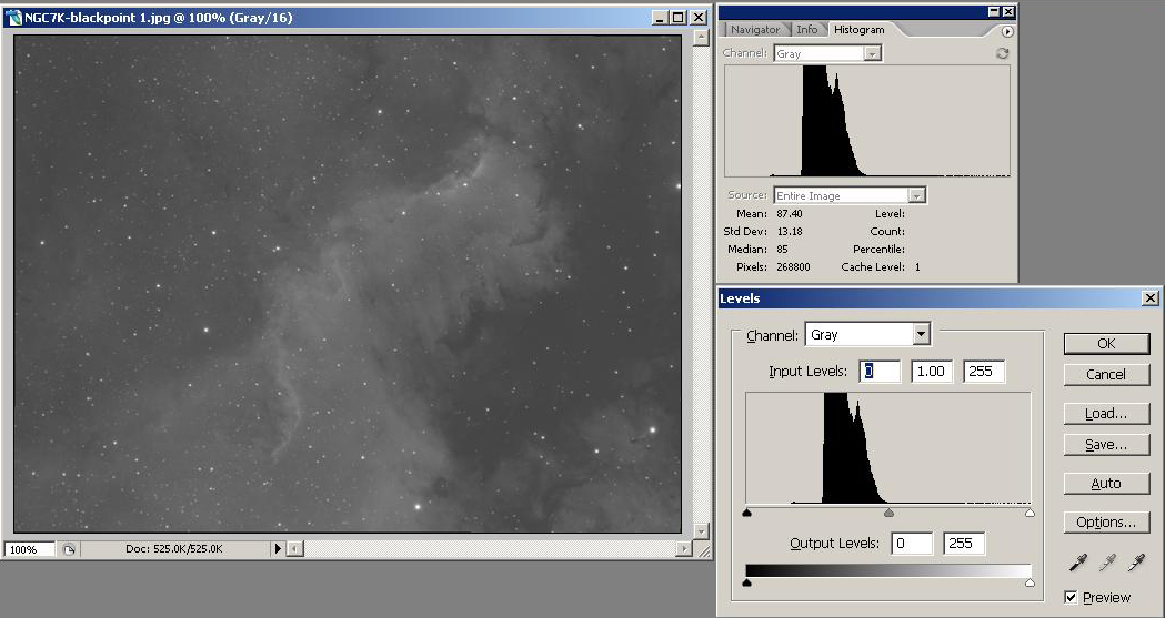
In the following image of part of NGC7000, the black point has not yet been adjusted. At the moment, the image has very little contrast. As can be seen from the histogram, there is a the main block of data, then a thin black line to its left. This is very faint, dark data. We don't want to lose this as we can enhance this later on. To the left of this data, there is no line. As there is no information, we can lose this area.
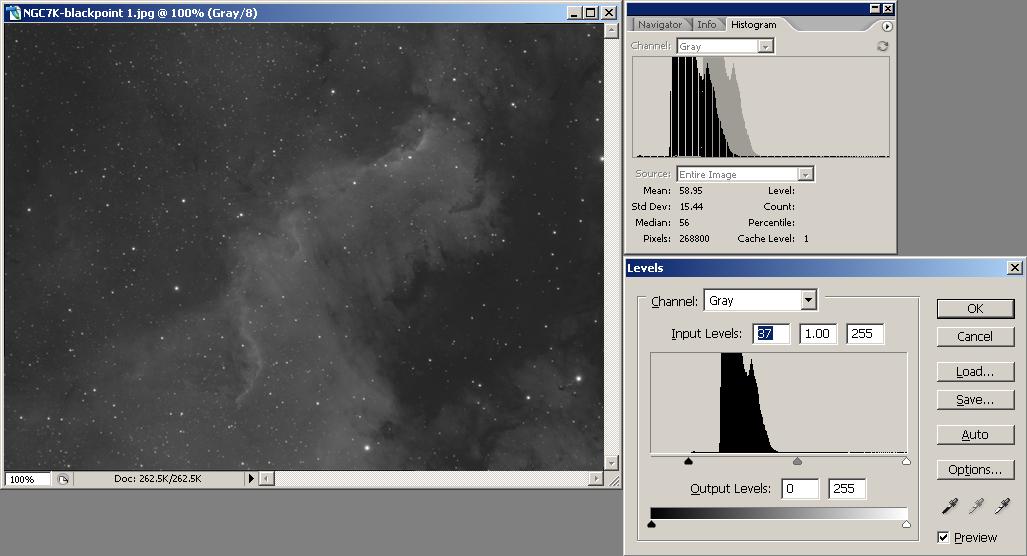
In the next image, the black point has been adjusted, and placed just to the left of the start of the faintest data. The main block of data has moved to the left, and also been stretched a little. The image now has more contrast, but none of the faintest data has been lost. The histogram displays a preview of what will happen to the data once OK has been selected.
In the LEVELS box, where it says 'Input Levels' the levels of the black, grey and white points are shown. The black level is 37. Complete black is zero. This means the darkest part of the image is dark grey, not black. This is now the new black point.
To adjust any of the levels, either highlight the number and use the arrow keys, or LEFT CLICK and HOLD, while dragging the slider. These are directly under the graph.
The White Point.
Leave this well alone! Adjusting it to the left will brighten the image, but it is almost certain that you will lose detail in the brightest areas if you brighten the image this way, and your brighter stars will all end up with the same colour values in each channel, meaning that they will end up being pure white, and lose all colour.
Here is an example of the white point being clipped. I have heavily clipped the image to demonstrate the effect of the clipping.
And this is it's histogram. As can be seen, the data goes all the way to the right, ending in a vertical line. All detail at this point is pure white, and has been lost irretrievably.
Curves.
To brighten an image without clipping, you need to use Curves.
Curves allow you to stretch an image in a nonlinear fashion, which allows a great deal of control. For example, when brightening the faint areas of targets with a high dynamic range (where there is a great deal of difference between the dark and light areas), such as galaxies, you can stretch the areas you want to brighten, without also stretching the bright areas, and maybe burning them out if you're not careful.
You can set specific points using curves. Simply put your mouse cursor over the exact area you want to adjust, and then hold CTRL, and LEFT CLICK. You can now either drag this point by using the cursor while holding the left mouse button down, or use the arrow keys.
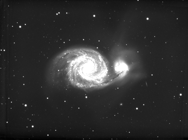
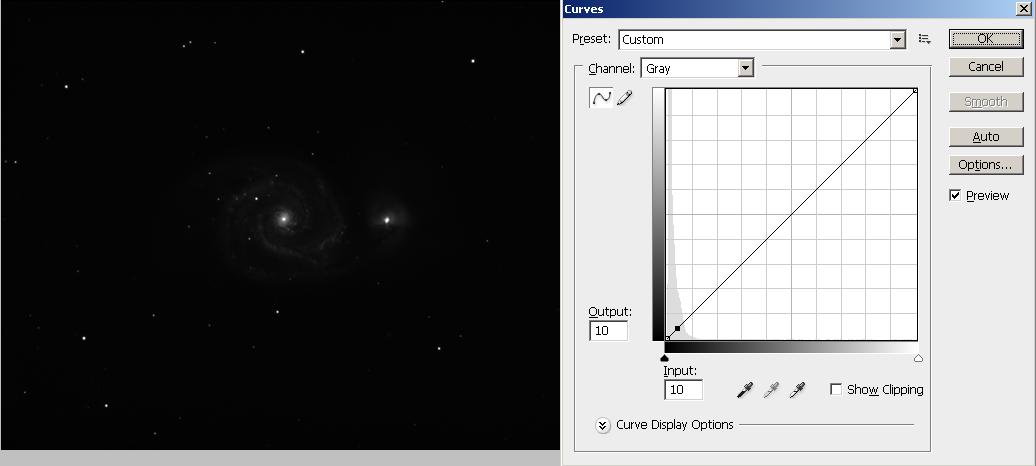
Here's the unstretched image with the curves dialogue window showing and the first point placed. At this point, the image hasn't been stretched. The first point was placed in the very dark area of the outer spiral arms and can be seen as a small black square within the grey data curve to the bottom left of the graph.
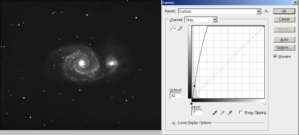
The first point has now been stretched. As can be seen, the dark spiral arms have been brightened, but the core of the galaxy has been clipped. The line on the graph goes steeply up to the top and reaches the top a long way to the left of the graph. This must be avoided, as all data to the right of this point is now clipped. With curves though, this is easily dione by adding more points.
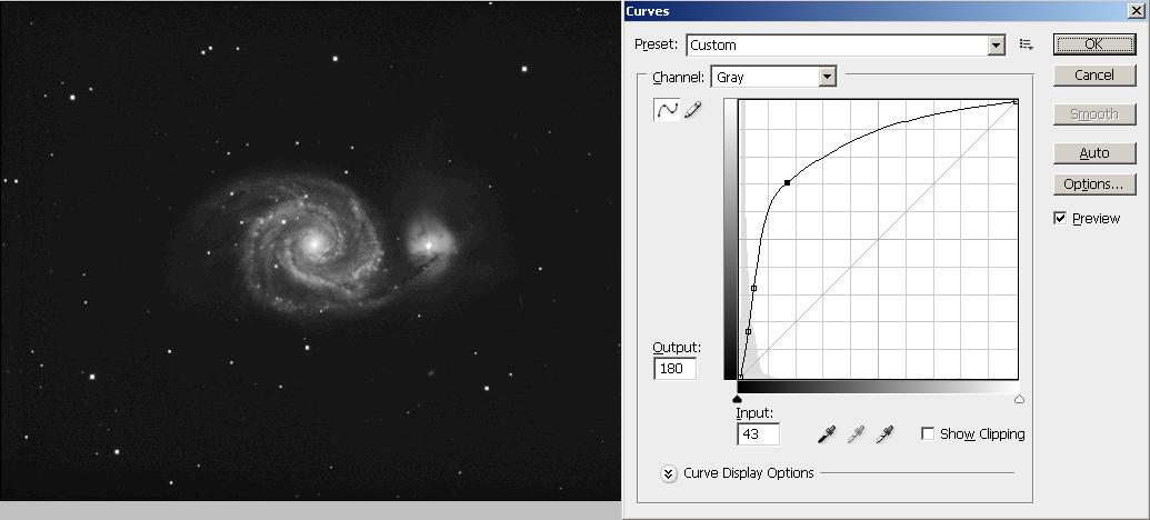
Two more points have now been added. One is in the mid grey areas, and another is placed higher up the line. The line from the 3rd point now goes almost straight up to the top right corner. No data has been clipped but the darker areas have now been brightened, while the bright areas still contain all of the original data.
In general, I find, that after the initial stretch, it's best to do further curve adjustments in small increments, but each image is different and there is no set of unbreakable rules. Experiment and get used to the way the curves tool works. It is possible to make very fine adjustments to specific areas of an image by setting a point, and then setting several anchor points either side of it. Practice is the key!
You can of couse go too far!!
This image has been stretched way beyond where it should have been left alone.....in order to go this far, much more data is required in order to bring the signal to noise ratio down. It's all about data....the more you have, the better the S/N ratio, and the more you can stretch the image.
This is the histogram for this image. The noise can be seen in the spikey appearance of the curve. If this effect starts to appear on your histograms, you have gone too far and need to back off until you have a smooth curve again. If you need to go deeper, you need more data!